How to Visualize Key Climate Change Question in 7 Interactive Emissions Charts
How to Visualize Key Climate Change Question in 7 Interactive Emissions Charts https://www.johannes-friedrich.com/wp-content/uploads/2019/12/7visuals-1024x698.png 1024 698 Johannes Friedrich https://www.johannes-friedrich.com/wp-content/uploads/2019/12/7visuals-1024x698.pngUtilizing data visualization can be one of the best tools for compelling communication in an organization, especially in the field of climate change.
This blog illustrates how to 1) answer a common or interesting climate change questions 2) with an engaging, intuitive and interactive visual. I will also 3) explain why each visual works and 4) how to build your own.
This series of visualizations below may provide some inspiration how to combine data and interactive charts techniques to provide engaging answers.
Most visuals in this blog rely on data of the Climate Watch project, which I manage at the World Resources Institute. Disclaimer: This blog is written in a personal capacity and does represent only my personal views.
1) How has the climate changed since you were born?
Climate change has not just happened recently – we have been putting greenhouse gas emissions into the atmosphere for centuries now. The causal chain is simple: We emit greenhouse gases (mostly carbon dioxide, CO2), which increase their concentrations in the atmosphere, which in turn traps heat and has a warming effect on the climate.
To illustrate the point, the visual allows you to hover over your birthday below to see the how emissions, concentrations and global temperatures have changed since that year.
Why this visual?
Making a personal connection will help communicate that climate change is already happening now. Sometimes even old data, visualized in a personal, novel way way can help you get more attention and reach a much broader audience than just explaining it in writing.
The interactivity allows you to select your birth year quickly with just your cursor. Though the up and down movement of the chart is unnecessary, it makes the chart a bit more interesting than just having a standard line chart.
How is it done?
The visual is build in ObservableHQ and you can make a copy or download it.
Note that the chart shows three different data types on three different scales. That is why it does not have a labeled y-axis. If you hover over a year it will show you the increase of these three variables from your selected year at the top right. One confusion that might come up is for temperature, where the chart shows increase in annual average temperature compared to the average across the years 1951-1980. This means that the 1900 averge was 0.2 degC below the 1951-1980 average (which the number right above the green dots indicates). In turn the increase from the 1951-1980 average was 0.92 degC. However the number on on top show the increase since on specific year, which would for example be 1.1 degC compared to 1900 (0.2 + 0.9).
2) Who are the largest global emitters?
This question is more difficult than it seems. While total emissions matter, we need to consider many different other factors as well if we compare countries. Let’s look at this from a few different perspectives:
2a) Who are the top 10 total emitters?
What matters to the climate and how much temperature will increase is how much we emit in total globally.
The top 10 emitters contribute nearly two-thirds of global greenhouse gas emissions. Click on the chart below to zoom into a country and see what the main emitting sectors are.
Why this visual?
This Sunburst chart is basically a hierarchical pie chart. A normal pie chart could also do it, but wouldn’t that be kind of boring? The advantage of using this chart is that you can more clearly highlight the 10 emitters as well as provide one more level of granularity – the emitting sectors.
Also note in this chart that these numbers can vary depending on whether you group the European Union as one country (like done in this chart) and what sectors you include. For the chart above I am excluding land-use change and forestry because those values can be negative (a carbon sink) and cause problems if you want to visualize percentages. It also excludes bunker fuels, which are international aviation & international shipping and are usually not included in country totals.
Sunburst charts work with hierarchical data that add up to a percentage total. This is particularly useful for emissions, but also works with other information, like trade products categories or causes of death. Another advantage is that you can even flip the categories, to show the data first by sectors, then by gas. For more on this, see question 4 below.
How is it done?
This sunburst visual is created in flourish.studio and can be cloned there. You can also see a D3 version of this chart here.
You will just need the most granular type of data. So in the chart above we are using a table that contains all sectoral emissions by country and totals are calculated automatically.
2b) Who are the top emitters per capita and historically?
There are several different perspectives when it comes to comparing countries, since they have different populations and a different history. Let’s look at how a the (latest total) top 10 emitters compare based on their total emissions, per capita (per person) emissions and cumulative emissions since 1850 (adding up each year’s emissions).
Why this visual?
The question of responsibility for climate change is common and a holistic account must be taken to achieve greatest honesty and not blame a single country. The reality is that there are many indicators that can be used to show responsibility or what’s ‘fair’. There are whole tools that just aim to visualize all of the different indicators related to ‘equity in climate change. It’s best for you to know that there is not just one simple answer. Sometimes highlighting how different perspectives emerge depending on the data and visualizations can be helpful in providing a nuanced view.
How is it done?
They are three separate visualizations based on flourish.studio and Climate Watch data: Total emissions numbers, per capita numbers, and calculated cumulative numbers adding up annual emissions starting in 1850.
3) How have the top emitters changed?
The charts below show the trends for the top emitters over the last 56 years. Note that the y-axis has a different scale on each chart, so they only show relative change.
We can see that some countries were already able to peak their emissions (albeit on a high level) and many low emissions countries are catching up with the higher emitters. Refer back to question 2 to see how their emissions look relative to one another.
Let’s look at another picture. The chart below shows how the the (latest) top 10 emitters have changed their share of emissions over time. While the top 10 emitters have changed their emissions a lot in the last 100 years, the share of top 10 emitters has stayed mostly the same. The reason for this is that while the top emitters have increased their emissions a lot the rest of the world has also increased its share. The message stays the same, the top emitters need all pull together to reduce their emissions. Press play on the chart to see the changes from 1900 to 2016.
Why these visuals?
The first chart is commonly called ‘Small Multiples’ and can show comparative trends of different entities next to each other. The advantage is that you can show data that has different scales without overloading one single chart. Alternatively you could also use an index chart, similarly to the first one in this blog.
The second chart is a Treemap and is actually using the same hierarchical approach as the Sunburst, but also includes a timeline. You can use them interchangeably; I just introduced a Treemap here to show an alternative to the Sunburst.
How is it done?
Both charts work on flourish.studio. The the small-multiples chart uses time series of the largest emitters and the Treemap combines hierarchical data with time series.
A challenge you will face regularly is to have this data in the right table format, with years also being a column. Manipulating tables by turning rows into columns and vice versa is called “(un)pivot” (I have also heard the term “normalize” in the past, but this actually would refer to getting data into a common range, like 0 to 1). The goal in most cases is to only have one column that actually hold your main value (like emissions). In the example below, the table on the left mostly works, but the emission by years are distributed horizontally. The table on the right makes the year another column and has only one column for emissions.
You can pivot data using Microsoft Excel and its Power Query functions. Of course there are also other, more open software that can do it, just try a Google search.
5) What is driving emissions?
A few key sectors are responsible for an increase in emissions. The energy sector is still the single largest contributor, with nearly 75% of emissions. Within the energy sector the power sector and transportation make up most of the emissions, with both still on the rise. Outside of energy, industry and agriculture are also significant sources. Industry has doubled since 2000 to become the third largest emitting sector and agriculture has slowly risen by 13% since 2000.
Why this visual?
You might notice that the grouped-circle visual uses the same hierarchical data we have used before in question 2 and 3. This is to illustrate that data can be used to answer different questions depending how you structure and visualize it. Instead of having a country perspective this chart is using sectors as the first level and gases as the second level to show which economic sectors are the main drivers.
How is it done?
If you have prepared your data once you can easily use it for Sunburst, Treemap and Grouped-Circle visualizations. You can clone the the visual on flourish.studio and also change the chart into a Treemap or a Sunburst
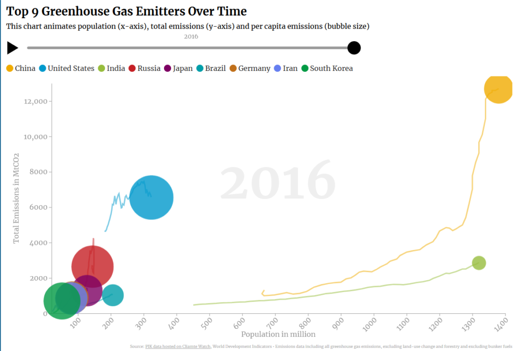
Bonus question: Can you show me all this data in one chart?
Sure, we can also utilize Hans Roslings famous bubble chart to show you the different dimensions in one visualization. You can also explore the data further with the Google Public Data Explorer.
I hope this will give you some inspiration to enhance communication of climate change within your organization. If you have any questions or suggestions, feel free to leave a comment or write me an email and make sure you check out my work with the World Resources Institute.
Leave a Reply